Leeds Beckett University - City Campus,
Woodhouse Lane,
LS1 3HE
Customise style and theme
Page last updated:
As a course team, you may wish to create a visual identity for your modules.
This staff guide provides some tips about customising the appearance of your modules in MyBeckett.
You may have noticed that since the MyBeckett Upgrade a few changes to the Look and Feel options, such as the colour theme has been removed to ensure that Blackboard meets web accessibility standards across different devices.
In MyBeckett, you have the choice of viewing your Modules and Communities (course groups) pages in a List or a Tiled view using the toggle buttons at the top left of these pages.
In List view, modules and communities are displayed alphabetically with the ID, title and other information such as the enrolled instructors.
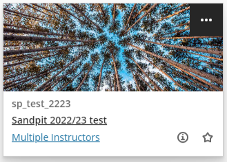
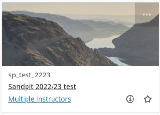
In Tiled view, modules and communities are displayed alphabetically as picture cards with the ID, title and other information such as the enrolled instructors.
- If you have already added a banner image, this will be cropped and used in the tiled card view.
- If you have not added a banner image, a stock image will have been selected automatically. You can change this by following the steps in this guide.
Tips:
- the minimum recommended size for the image is 1200 x 480 pixels
- try to keep the main content in the middle of the image so that it remains visible when scaled for different devices
- in general, an abstract image will work better than an image containing text
To change the image:
a. In MyBeckett, click Modules or Communities (depending on whether you are looking for a module or a course group)
b. Click the grid icon at the top left to switch to Tiled view (the three lines icon returns you to List view)

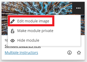
c. Hover over the module or community that you want to edit
d. Click the three dots that appear at the top right of the card
e. click Edit Module / Community Image
f. In the panel on the right, click Upload new image
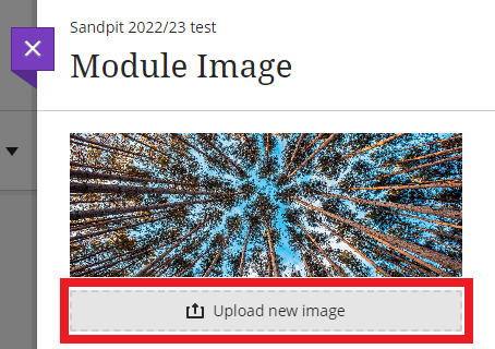
g. Browse your device to find the image you want to upload
h. You can then click and drag or use the arrow keys to reposition the image
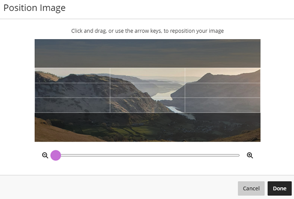
i. Click Done
j. Tick to mark the image as decorative, or if untick this if you want to provide a description of the image for screen readers.
k. Click Save.
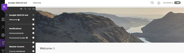
l. The image will be displayed on your module in tiled view, and also as the banner image when you open your module.
a. In your module, first make sure that the content area that you would like to use as the home/landing page (also known as the 'module entry point'), that your students will see is not empty. For example, you could add a content item containing a short welcome message. You can always go back and edit this again later.
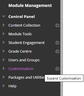
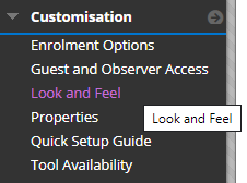
b. In the Control Panel at the bottom left, click Customisation.
c. Click Look and Feel.

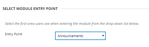
d. Use the drop-down list in the Select module entry point section to choose the new module entry point. We recommend that this is a content area such as 'Welcome'.
Warning: don't select an external link for the module entry point, as this will prevent students from accessing module content.
e. Click Submit.
a. In a module's Control Panel (at the bottom left), click Customisation.
b. Click Look and Feel.
c. Under Default content view choose how you would prefer to display content to students (please consider accessibility):
Example of 'Icon Only': This option will show titled icons without descriptions.
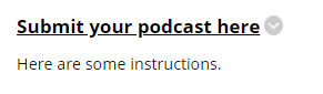
Example of 'Text Only': This option will show titles and descriptions, without icons.
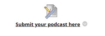
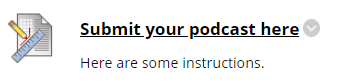
Example of 'Icon and Text': This is the default option, which shows titled icons with descriptions.
d. Please note, changes to the default content view will only apply to new content areas. You can change existing content areas by ticking Apply this view to all existing content.
e. Click Submit.